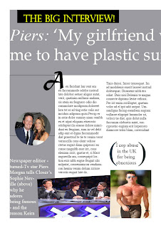

This is my improved version of my double page spread. I changed the first one, by firstly, completing the left part of the double Page spread. After I done that I decided to make my own decisions and change a few elements that I thought could be better, For example I changed the font of the head line because I wanted it to look more creative and stand out.
No comments:
Post a Comment